Wednesday, October 27, 2010

Culturele Woensdag - Duurzaamheid

27 October
Utrecht - HKU


So a new cultural Wedensday with our two new tutors - and its been a good one!

Over the last week, our task had been to collect all our rubbish...well all things that wouldn't rot or decompose in the mean time...or certain unmentionables.  So we each came to class dragging our bags of rubbish - some noticeably bigger than others.

This cultural Wednesday, our theme was 'duurzaamheid' - sustainability.  We spend the first few hours of class discussing different aspects of sustainability - looking at a variety of examples and issues.


Our fist task of the day was to get together in groups of three, and answer the following three questions:

In terms of sustainability:
     1.  What is nonsense/'bullshit'?
     2.  What is interesing?
     3.  What can we do as a designer?

Interestingly, there were a lot of similar answers within the class.

1.
+ There was a lot of mention of all the claims by products to be 'sustainable' or 'ecologically friendly' when  they're not.  For example a mayonaise that claimed to be eco friendly because they used free range eggs.  However the oil they used did more than enough damage to outweigh the good.
+ Companies that claim to be green purely to create advertising advantage.
+ The fact that some people still don't think sustainability is an issue worth talking about.
+ I also think its also nonsense that so many people talk big and talk green, but don't do anything about it.
+ We're so focused on trends and fashion fads  - so many things are bought just to last for the 'season', then to be replaced by some thing new.  How wasteful.

2.
+  Thinking creatively and innovatively about a serious problem to create something that reduces the issue and perhaps adds to/improves our lifestyle
+ A lot of people mentioned the electric car
+ How a few small changes in our lifestyle can make a big difference in the long run
+ All the new innovative designs being produced as a reaction/ in response to the issue.

3.
+ Its our responsibility to think of more sustainable options/ solutions
+ Take a stand for sustainability and act on it
+ Look at the way we use materials, what materials we use, new ways of manipulating old materials
+ Look at the whole product/design life cycle - what happens at the end? Thinking long term rather than short term
+ Ways of extending the life of existing products/materials/designs - altering, upgrading, adding, recycling

I can keep on going!

Our next task was to look at our weeks worth of rubbish and order it into some sort of form.  People looked at colour, time of day, size, calories etc.  and used a form to reflect this.
I had some small cardboard model pieces that I'd used to create the floor plans of one of my designs.  I'd labled them all with the spaces they represented.  So I used these, in combination with the rubbish to create a 'floor plan' or 'footprint' of where my rubbish is created.


After reducing my little creation back into a pile of rubbish, I made my way back to the lecture hall.
When I walked in, I saw a growing pile of refuse growing in the middle of the lecture hall and was told to add my load to the pile...pretty impressive collection.  80 students and 1 week:


After splitting into groups of 5 (roughly :P) we were told make a collection of items.  We had to choose what elements we'd look for - eg. colour, size, ability to be blown-up, health foods
I'd suggested bottle tops...seemed like a fun thing to collect, and everyone was pretty happy to give us the bottle tops from their collection.  We started organising them in colour and it became a happy little collection:


On the way down to the canteen we decided to recycle the bottle tops, and give them a second life - as a lampshade.  We decided to hijack one of the existing lamps in the canteen, and give it a little makeover.


We organised in colour, and then started with the most prominent colour - blue, then continuing with contrasting/complimentary colours to keep it exciting.


 Job well done.


And for one of the other groups, took this little video...so thought I'd post it for them.


Friday, October 22, 2010

Culturele Woensdag - Opmerkelijk

13 October
Utrecht - Oude Stad

This lesson, we were divided into groups and given a word.  Our task then, was to describe the word using aspects of Utrecht.  
My group was given the word "Opmerkelijk" and our location was Utrecht's Oude Stad.

We took some time to brainstorm - what the word means, how we might find/create this, and how to document it.  
So when we thought of 'opmerkelijk', we thought of words such as remarkable, unique, stand out, unusual, astonishing, sensational, out of the ordinary.  
Our next stop was to translate this into something visual.  Our first inclination was rather obvious considering our location - make something outrageously strange and 'postmodern' and place it in the old city. Definitely 'opmerkelijk', but not new or innovative, we were advised to try something a bit more subtle, make more use of the historical, old city.  

So our approach:
Introduce everyday modern items into the city in an unusual way, thus drawing more attention to the banal everyday items as well as the pictured aspect of the city.   

We walked around the city and tried to discover parts/elements of the city that wouldn't normally catch our eye and highlight them.  For example, hanging our bags on the railing of one of the bridges. In the end, it was the more subtle changes that were the most powerful.  For example, carefully placing our mobile phones in the small carved niches of an old church door.  They almost looked like they were a part of the design, and it definitely made people look twice!


Wednesday, October 20, 2010

Culturele Woensdag - Amsterdam

6 October
Amsterdam


This week we were sent out all on our own to Amsterdam.  I was armed with my list of exhibitions, a map (bought at the station when I realised that I somehow had to find them all), some questions, my camera, a notebook and 4 hours. 
From the station I decided to hit the first closest exhibition on the list.  After taking the wrong ferry and walking around for a good 10 min finding the place I finally arrived at my first destination:


+ Beeldhalwerk, in de Kromhouthal

Wat is het tentoonstellingsconcept van Beeldhalwerk en hoe ervaar je dit?


Sohrab Bayat, one of the artists says: 'Wij nemen het heft in eigen handen. Ons uitgangspunt voor deze show is wat wij als kunstenaars goed vinden en wat wij graag willen zien. Het zijn onze subjectieve keuzes, maar dat heeft geen verdediging nodig. Ik hoef mij niet in te dekken met allerlei theorieën. Ik weet als kunstenaar wat ik goede kunst vind.'
The set up reflects this ‘concept’; all the sculptures are placed close together, so that each glance catches more than one piece.  Some sculptures reflect others, or move others and various sounds echo throughout the hall.  They don’t seem to follow any ordering rules, contemporary sculptures mixed with older works and all different techniques placed next to each other.  The only structuring elements are the black rubber matting under each sculpture.  This not only lets the viewers
know where not to walk, but give each sculpture their own sense of ‘boundary’ and ownership of space, however minimal.


Zou je het zelf ook zo doen?

I found it a bit chaotic at first, but after reading the intention behind the collection, the presentation makes sense.  Some works would have been nice to experience in a more ‘quiet’ space.  However, I did like the way some of the sculptures reflected other works on display or how the spinning of the big fabric umbrella moved some elements of a sculpture below it.  Sounds from various artworks could be heard throughout the space, so it felt that somehow they were all connected.  I liked the relaxed atmosphere, and I think it suited the works.  As a visitor, I felt like I could casually observe the works without feeling like I was being judged for the ways I viewed them. 
The setting was good, and I would use a similar large space but something slightly more neutral.   The lighting was good and the height of the ceiling made everything feel less cramped. 
I really enjoyed climbing up the ‘view tower’ to experience the exhibition from above, it was great to get a different perspective of the works.


View from the tower


My next stop was:


+ Installatie van Krijn de Koning, Nieuwe Kerk Amsterdam

Hoe ervaar je ruimtelijkheid van het werk van Krijn de Koning?


We experience the space standing on a flat plane, elevated from the ground.  The railing isn't a focus, so we experience the whole upper space of the church.  The eye follows the structural and architectural details within the church.


His artwork within an artwork makes use of colour to emphasise each space, and windows to connect between them.  It feels very personal and private.  A very different type of space that the visitors can experience.


Hoe ervaar je de kerk, nu je op 5m hoogte kunt lopen?


I was less affected by the sense of height that one usually experiences in a church, where the focus is usually in drawing the eye up to the 'heavens'.  However, being at this height allows the viewer to better experience all the details.  For example, the stained glass windows are now on eye level, and all the ceiling ornamentation and column details.  At this height we can better appreciate the craftsmanship and artistry present within the church.


Hoe ervaar je de kerk erna als je weer beneden staat?


Back on ground level, I think most viewers have gained an appreciation for the architecure, and the details present.  Perhaps more of a focus on the parts of the whole, and what role they play.
I personally also loved walking through the forest of scaffolding - Also a very different and strange way of experiencing the church.


Last on the list was:

+ Stedelijk Museum, Paulus Potterstraat
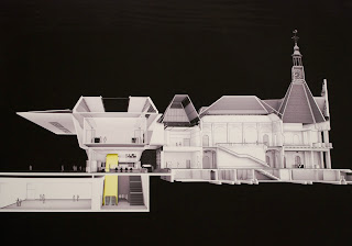
Hoe verhoud de nieuwe ingang zich met het oude Stedelijke Museum?

They are clearly built for very different times.  The old entry is respectable and functional, opening into a nice forum/reception space.  Now, as a museum acting on an international scale in the 21st century, the new entry is much more innovative and creative. It also provides necessary extra exhibition space.


In terms of placement, the new entry places more emphasis on the Museumplein and connections with the other museums. I think this movement towards a ‘forum’ between all the museums is a very interesting and valid idea.
The connection between the old museum and the new entry has been treated very sympathetically.  The lower level’s glass walls allow a visual connection with the old building. 


Geeft het een extra stimulans om binnen te gaan?

Yes, I believe it will.  Because it is unusual, innovative and striking, I think it will attract a lot of attention and interest. 

Geeft het een extra gewicht aan de collectie?

I think the new entry better reflects the museum’s collection and its status as the largest museum for modern and contemporary art and design within the Netherlands.  The entry is one of the first things visitors will view/judge and they’ll be seen presenting something creative and innovative.  This exterior will give more meaning to the interior collection. 


On the way home though, I also managed to visit one last exhibition:


+ 10 Years via Milano, New Dutch Design


I was very excited to see this exhibition, and wasn't disappointed.  It was great to physically stand in front of designs that I'd idolised in magazines as well as getting a chance to see some completely unfamiliar work. I've included a few of my favourites.  


I loved this idea:
"A glass ring for catching and treasuring tears. The falling tear is caught in the cup of the ring where it slowly rolls to the centre. Here it eventually evaporates leaving behind nothing but a memory and a small trace of salt"
Brands as the new religion.  The reflection is of the stained glass window from the church this exhibition was in...fitting.
When the tiles are dry, they just look like plain tiles, only when wet do the patterns/ decorations become visible. For a country with a lot of rain and depressing weather, seems like a pretty awesome concept.
'Aireborne Snotty Vase, Sinusitis Large' - Marcel Wanders
"The Snotty Vase collection is made up of five different vases: Coryza, Influenza, Ozeana, Pollinosis and Sinusitis. The shape of each vase is based on snot, caused by one of the above five conditions, which has been sneezed out, scanned and then 'printed' 3 dimensionally"


And thats the end of a long, busy, but exciting day exploring Amsterdam!


Wednesday, October 13, 2010

Culturele Woensdag - Rotterdam

22 September
Rotterdam

+ The day began at 10am Rotterdam station, luckily I knew where I had to be by following the huge group of students. We started by walking through the city direction Booijmans.  This took us past the Westersingel, and a collection of sculptures.

Watersculpture - ironically made better by all the algae

A little bit disturbing and strange


+ Then it was the Booijmans.  The first exciting thing to be seen was the 'garderobe' in the museum's entry foyer.  It was an installation I'd once admired in a magazine on my couch in Sydney, and now I not only got to see it in person, but use it too! 

Thats my cardigan on the left!  
Amongst a variety of impressive exhibitions, my favourite was  Olafur Eliasson's "Notion Motion".

"Notion motion bestaat uit drie delen, waarin de interactie tussen water, licht en de bezoeker centraal staat. Met eenvoudige bestanddelen heeft Eliasson een fabelachtig werk gemaakt. Hij dompelt de beschouwer onder in een overweldigende visuele wereld, die tegelijkertijd ook heel simpel en minimaal is. Dit alles wordt zichtbaar gemaakt door een wisselende interactie tussen licht en water."
Olafur Elliasson @ Booijmans

I love his clever and subtle installations, and have seen some of his works on display in Sydney before. They're always beautiful in their simplicity.  I also enjoyed being able to interact with some of the artworks, and set to jumping up and down on the floor with determination.


+ After the Booijmans we made our way to an exhibition of Joep Van Lieshout.  I found the whole exhibition quite disturbing, and some of the work a bit hard to stomach.  I found the first half of the exhibition quite clever and interesting, although it still gave me shivers.  Made me think of George Orwell's 1984.  The second half was the most disturbing, operating tables, drained bodies, gas masks, corpses, limbs.  I can appreciate the concept and meaning behind the work, and looking as an artist I was impressed by the artistry and composition.  But a more natural instinct in me shied away from the works.  Although, that is also one of the intentions of the exhibition - to shock, put on edge, disturb and provoke.  It was definitely memorable, and the name and images will stay in my mind for quite some time.